Eternity Time Log 1.8 is available on App Store with the following features:
- TouchLog – calendar like, zoomable, all touch-based log presentation and editing (iOS 4.0 or higher required)
- Pomodoro – current timer alerts (iOS 4.0 or higher required)
- other improvements
TouchLog
This is the feature I started working on over a year ago when some customers asked me for a “multiple timers” functionality. From my experience, running single timers “as you go through your day” is quite straightforward. When you need to fill a gap or mess with the older entries things start to get tricky. With wheel controls for date and time setting it’s fairly easy to make a mistake and define 24:15 long entry instead of 00:15 long one. It’s easy to create unintentional gaps and overlaps in your log. What’s worse it’s quite difficult to spot such mistakes and correct them in the table based logs presentation where 24h and 15min long entries look pretty much the same. What’s worst – it can invalidate large parts of your reports. With multiple timers all such problems would be much more common.
That’s why I was hesitant about implementing “multiple timers” until some better form of logs presentation and adjustment is in place. So I started working on a calendar-like view: pinch-zoomable, touch adjustable – the log that the touch based devices truly deserve. Only to find out that it worked great in a simulator on my Macbook, but on iPhone with OS 2.0 or 3.0 – not so great. There were graphical glitches and artifacts during zooming and scrolling that would not be acceptable in the final product. I tried different solutions but without success and was finally forced to drop the feature from the 1.6 release. That was very disappointing!
But with time, my experience grew, iOS evolved to version 4.0 and after releasing Eternity 1.7 I found myself working on it again and, more importantly, the prototype solution working nicely on a real iOS 4.0 device.
So enough complaining! Eternity with TouchLog is out it the wild and here is how it works.
Presentation

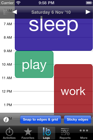
In TouchLog every entry is represented by a rectangle on a 24h timeline. Similarly to a calendar app. Except that in calendars, entries starting at the same time are usually presented “stacked”, with some vertical shift. So you need to look at times to figure out if they really started at different times or it’s just a layout thing. Short entries are also presented by rectangles with some minimum height, in calendars, so even 5min entry looks like 30min long one. It’s no biggie since you rarely define 10min or 5min long tasks in your calendar anyway. But with time tracking it’s a bit different. It’s quite common to have few minutes long entries and it’s quite useful to see if the entries start/end exactly at the same time and be able to adjust them as such. That’s why Eternity presents overlapping entries side-by-side instead of “stacking” them. Their height also always represents the duration. That’s why I consider zooming to be much more important in a log than in a calendar app and was so disappointed when I couldn’t implement it properly.
Navigation
You can go to previous/next day by swiping right/left (it also works in table view mode on iOS 4.0 devices). You can also tap on the left margin to bring top bar and select date from there. Tap on the top-left icon or the Logs tab to switch between table/TouchLog modes.
Settings
There are 2 settings which affect TouchLog. Tapping on the left margin presents bottom bar with “Snap to edges & grid” and “Sticky edges” options. Both affects how entries behave when you add or adjust them.
Zooming
You can pinch or double-tap to zoom in and out. The default zoom level gives you about 8h view, the minimum – 24h and the maximum – about 2h. 8h chunks are the way our lives are usually organized (about 8h of sleep, 8h of work, 8h of life ;), so I think it’s a good default. 24h should gives you a good bird’s eye view on your day, while 2h gives you max details without getting lost. Double tapping on entry zoooms it in/out. Different zoom levels give different grid resolutions: 1h, 30min or 15min.
Adding
There are 2 ways to add a new entry.
Two fingers tap & hold anywhere on the view creates a new blank entry. After lifting fingers, you can adjust and fine tune the start and stop times. After confirming you choose an activity and you have a new entry.
One finger tap & hold somewhere in a gap behavior depends on the “Snap to edges & grid” settings and other entries being visible on the screen:
– if Snap is OFF you just “draw” the entry from start to stop time
– if Snap is ON and there ARE entries visible at the top AND bottom, the new entry fills the gap. You can drag your finger to fit the entry into other gaps (if visible on the screen).
– if Snap is ON and there IS an entry at the top/bottom, the new entry snaps to it and lets you adjust stop/start time
– if Snap is ON and there AREN’T any other entries visible the new entry start time snaps to the nearest grid line (15min, 30min or 1h – depends on the zoom level) and lets you adjust the stop time.
When you’re done with adjusting times you can fine tune them, confirm, assign an activity and that’s it.
Adjusting

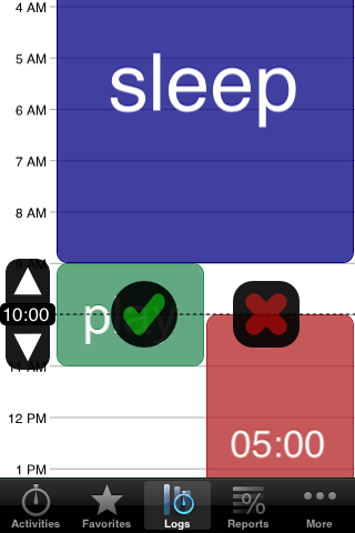
To adjust an entry start or stop time, tap & hold on the top or bottom half of the entry. Then drag your finger and lift it to fine tune the adjustments.
You can fine tune by tapping on the arrows on the left margin or by swiping left/right. Then confirm or cancel and you’re done.
All adjusted entries pulsate until you confirm or cancel giving you an easy way to tell what’s changed and what hasn’t. You can zoom and scroll when fine tuning your adjustments and if the adjusted edge goes out of the visible area, the adjusting controls will stay at the top or bottom to remind you to confirm or cancel.
“Snap to edges & grid” determines if the adjusted edge will snap to other entries edges or grid lines. “Sticky edges” automatically adjusts times for the adjacent entries.
Editing entry details
You can tap on an entry to bring the details edit view where you can edit times, activity, note or tags. You can also double-tap & hold to highlight any entry and then drag your finger to highlight any other. Lifting your finger brings the edit view or, if there was no entry highlighted, nothing happens.
TouchLog vs Table view
TouchLog view is designed for easy adding and adjusting while also giving you an easy way to spot and correct gaps and overlaps in your log.
Table view on the other hand gives you maximum information density on the screen and easy access to any entry, irrespective of its length.
I think both view modes complete each other very well.
Info
I tried to make TouchLog gestures as intuitive and discoverable as possible, but you can always tap on the ‘i’ button at the bottom-left of the screen for a quick reference.
Pomodoro – current timer alerts


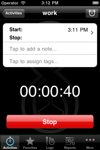
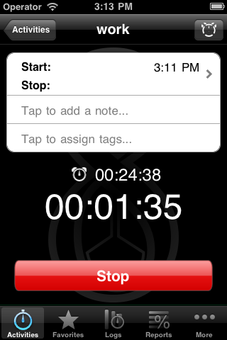
![]() Every once in a while I got a request for adding alerts to Eternity. The idea appealed to me because very frequently I use timer in my iPhone’s clock app to divide my work time into 30min chunks. This is a trick familiar to Pomodoro or similar productivity technique fans. Now you can enjoy it without quitting Eternity. When you have an active timer, you can tap on the top-right icon on the timer screen and set the alert. It uses Local Notification introduced in iOS 4.0 so you can quit the app and even delete it as a background process and you’ll still be alerted when the time comes. I think it’s a simple but useful addition to Eternity as a time tracking app.
Every once in a while I got a request for adding alerts to Eternity. The idea appealed to me because very frequently I use timer in my iPhone’s clock app to divide my work time into 30min chunks. This is a trick familiar to Pomodoro or similar productivity technique fans. Now you can enjoy it without quitting Eternity. When you have an active timer, you can tap on the top-right icon on the timer screen and set the alert. It uses Local Notification introduced in iOS 4.0 so you can quit the app and even delete it as a background process and you’ll still be alerted when the time comes. I think it’s a simple but useful addition to Eternity as a time tracking app.
Other improvements
Adding activities while selecting
Sometimes when you went to your log to insert a new entry or change activity assigned to an existing one, you found that it deserved a new activity in your hierarchy. Then you had to go back to Activities, add a new one, back to Log… No more. Now you can add a new activity right from the selection dialog.
Times on pie chart
Pie chart areas represent report percentages so some users requested that the labels would show reported durations instead of percentages. Now you can switch between them simply by tapping on the chart.
Date in every exported log row
Exported log CSV files contained date in the first column, but only in the rows where the date actually changed. This was fine for humans because the information would be redundant in other rows and would clutter the report. But machines and their spreadsheet apps often found it difficult to sort such logs by dates. So I added an option to put date in every log row, for the convenience of the machines and their masters ;).
Retina display updates
This release contains final updates for Retina displays. All artwork is is now hires. Pie charts rendering has also been updated to take advantage of the Retina display and the charts should be now much crisper on it.
That’s all folks :). I know there were more requests for features and small improvements and I’m sorry I couldn’t ship them in one Ultimate Update. I appreciate your patience. I’m already working on the next release, so stay tuned. Thank you for all the feedback and support making it possible!